case study
GREATER THAN ZERO PERCENTAGE
Recreating website for non profit organisation.
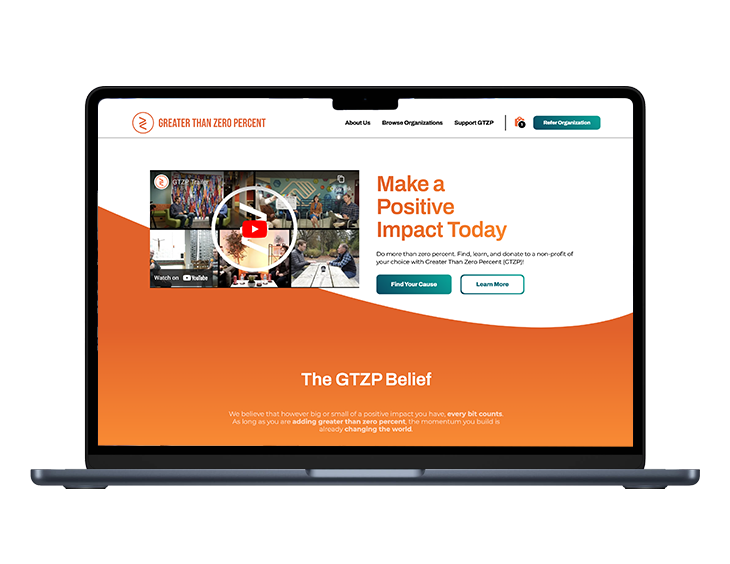
The Pro bono project was created for Greater Than Zero Percent (GTZP), a non-profit organization dedicated to sharing stories of incredible organizations around the globe. A redesign of GTZP’s website was undertaken in order to provide users with the opportunity to discover, engage with, and donate to organizations/causes they are passionate about.
Problem
Solution
Process
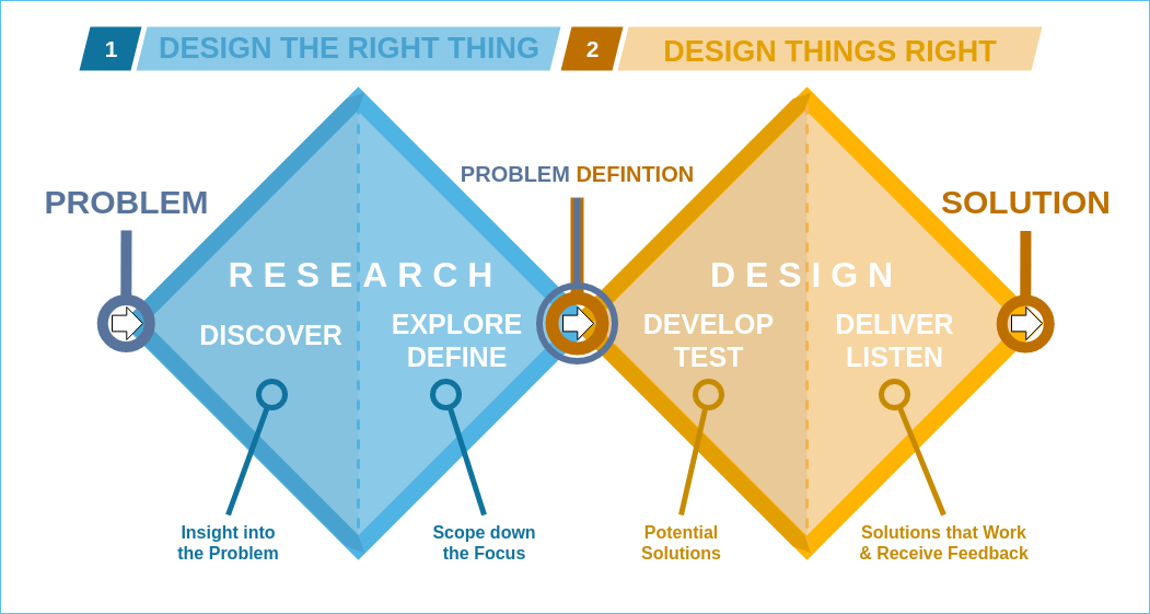
Research
Discover
As a team, we analyzed the website and listed pain points per page. By aligning the observed pain points with the user experience, this helped focus the research. The observations listed resulted in the following main pain points.
- Having trouble navigating
- Inconsistent UI (poor contrast, unclear text/images)
- Website lacked clarity about its purpose
Survey
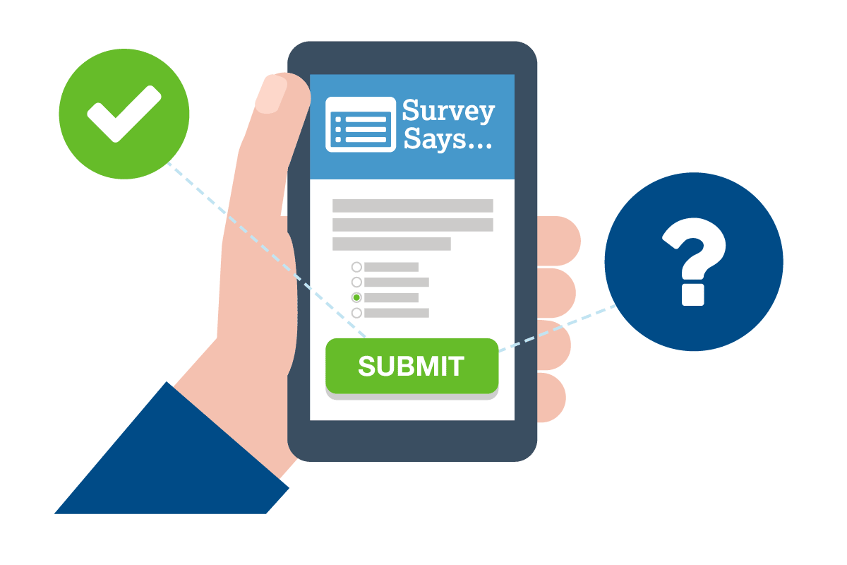
To get further evaluative and generative findings, we wanted to hear from the users directly what their issues with the current website where and how to best design a product that made sense for them.
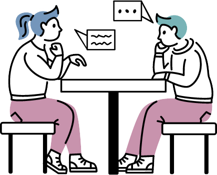
As a team, User interview was conducted about the website, The following were the key takeaway:
- According to the survey, respondents took into account cause, transparency, reputability, impact, and personal connections when deciding who to donate to.
- The main factors that determine which non-profit organization to donate to were personal connection and where their money was going.
- Lack of financial transparency and reputability were cited as the two most common frustrations by survey respondents.
Guerilla usability test
As our deadline was short and resources were limited, we decided to conduct a remote guerilla usability test. For our remote guerilla usability test, we gathered individuals that fit the current understanding of the target potential user based on our research and input from GTZP stakeholders.
A total of 3 rounds of testing were conducted with different test participants each time. Depending on deadlines, test objectives and the scope of the change being reviewed, remote moderated or unmoderated tests were conducted.
Participants were asked to complete tasks relevant to the version of the website being tested answer questions and received a score. We classified and counted the information from the guerilla usability test to determine the top pain points.
- Having trouble navigating
- Inconsistent UI (poor contrast, unclear text/images)
- Website lacked clarity about its purpose
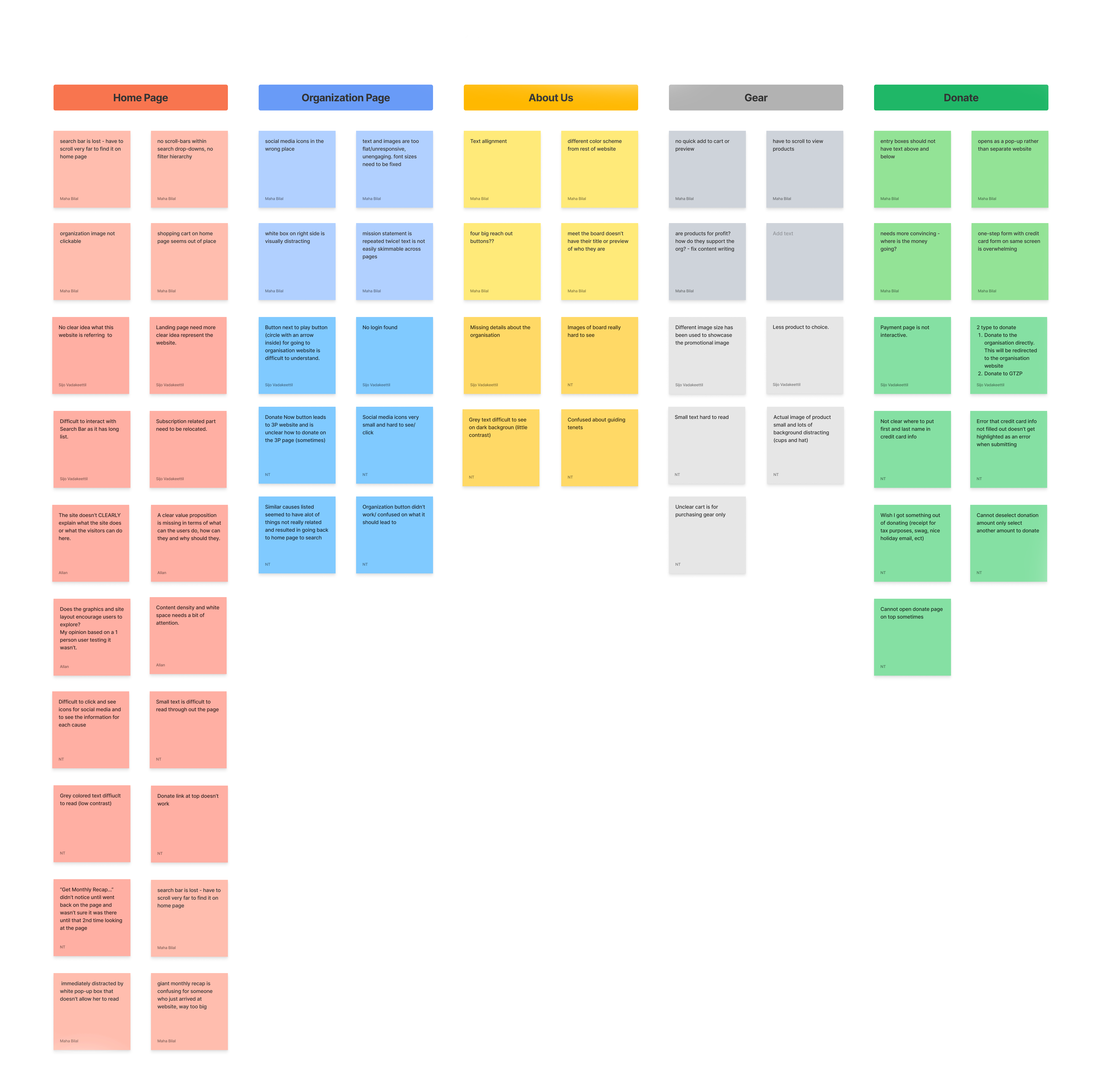
Affinity mapping
As a team we compiled information from over 120+ data points to identify the top pain points and focus items from the usability study. We classified the data into 8 classifications and 3 main themes based on Guerilla usability test.
The 3 main themes are as follows:
Competitors
Charity Navigator
www.charitynavigator.org
America’s Charities
www.charities.org
World food programme
www.wfp.org
The top findings about charity websites:
- This website has a confusing information structure and lots of pages, inconsistent design, and a confusing search function. There is a chance for improved design to facilitate easy navigation to learn more about charities.
- The aim of all charity websites is to create trust between the user and the non profit through transparency in their mission, donations, non profit status, location, links to connect with them and the ability to donate anonymously.
- The majority of charity websites provide too much information on one page, allowing for improved page layout and condensing of website content to only the items that have the greatest impact on usability.
Define
Persona
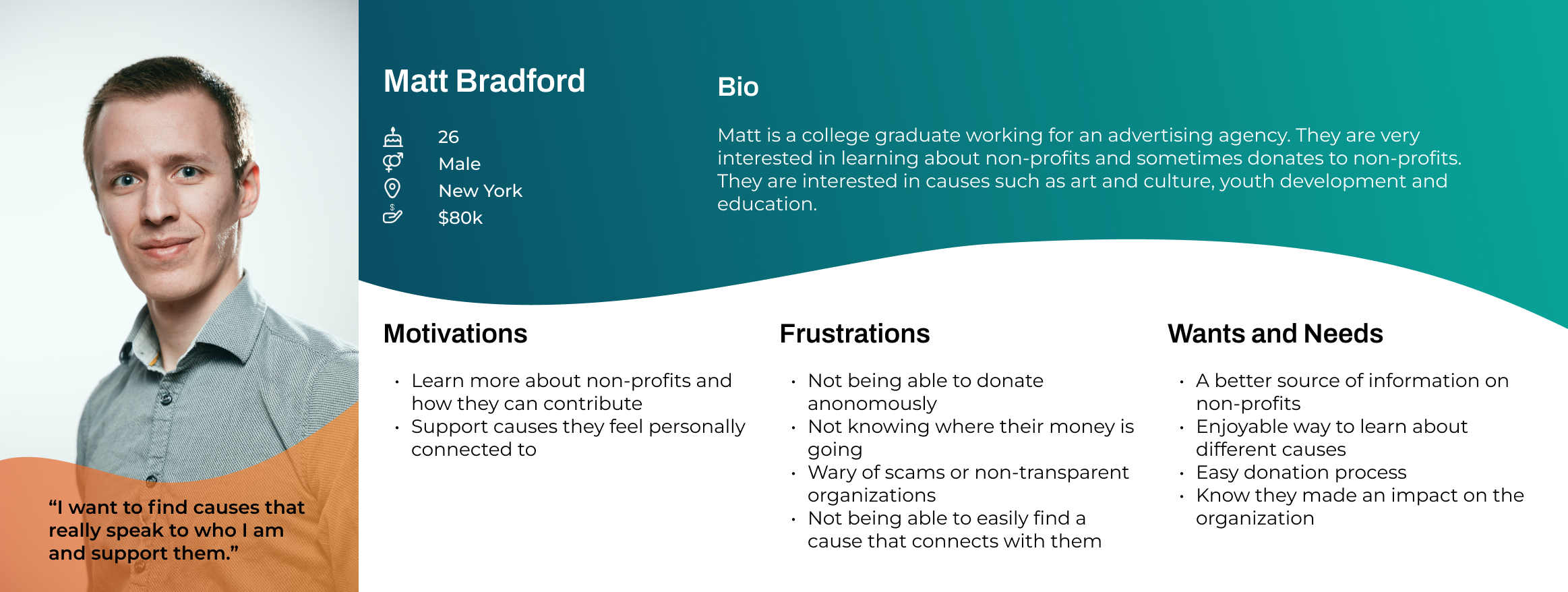
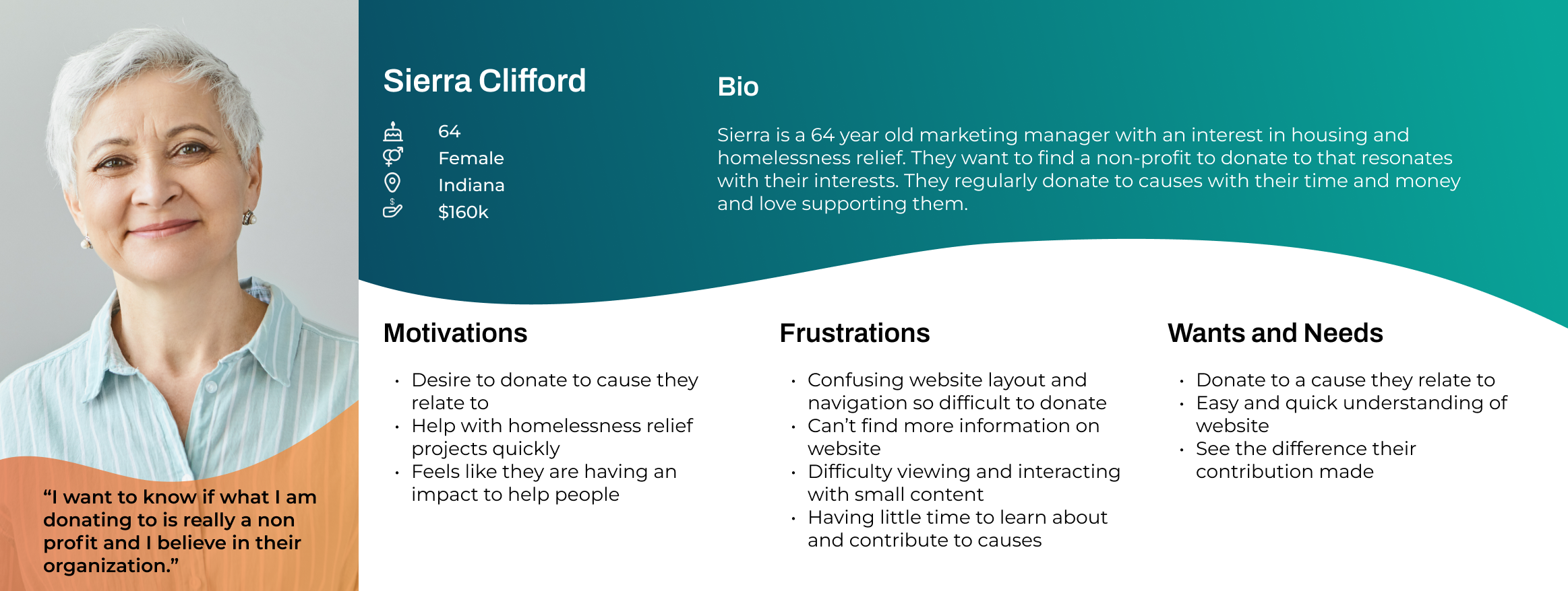
According to our research, there is a wide audience that can be targeted. The result was the creation of two personas with different demographics in order to have a “Curb-cut effect”. “The Curb-Cut Effect” describes how addressing disadvantages or exclusions experienced by one group of people creates an environment that enables everyone to participate and contribute fully. This concept was coined by Angela Glover Blackwell.
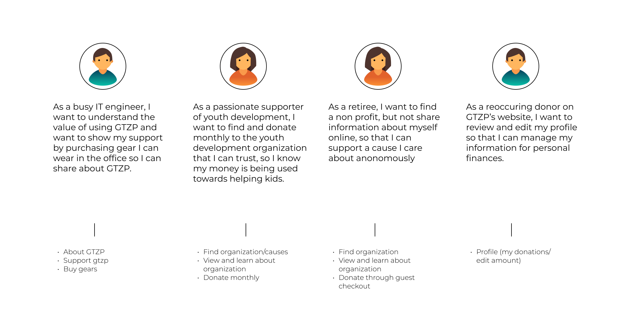
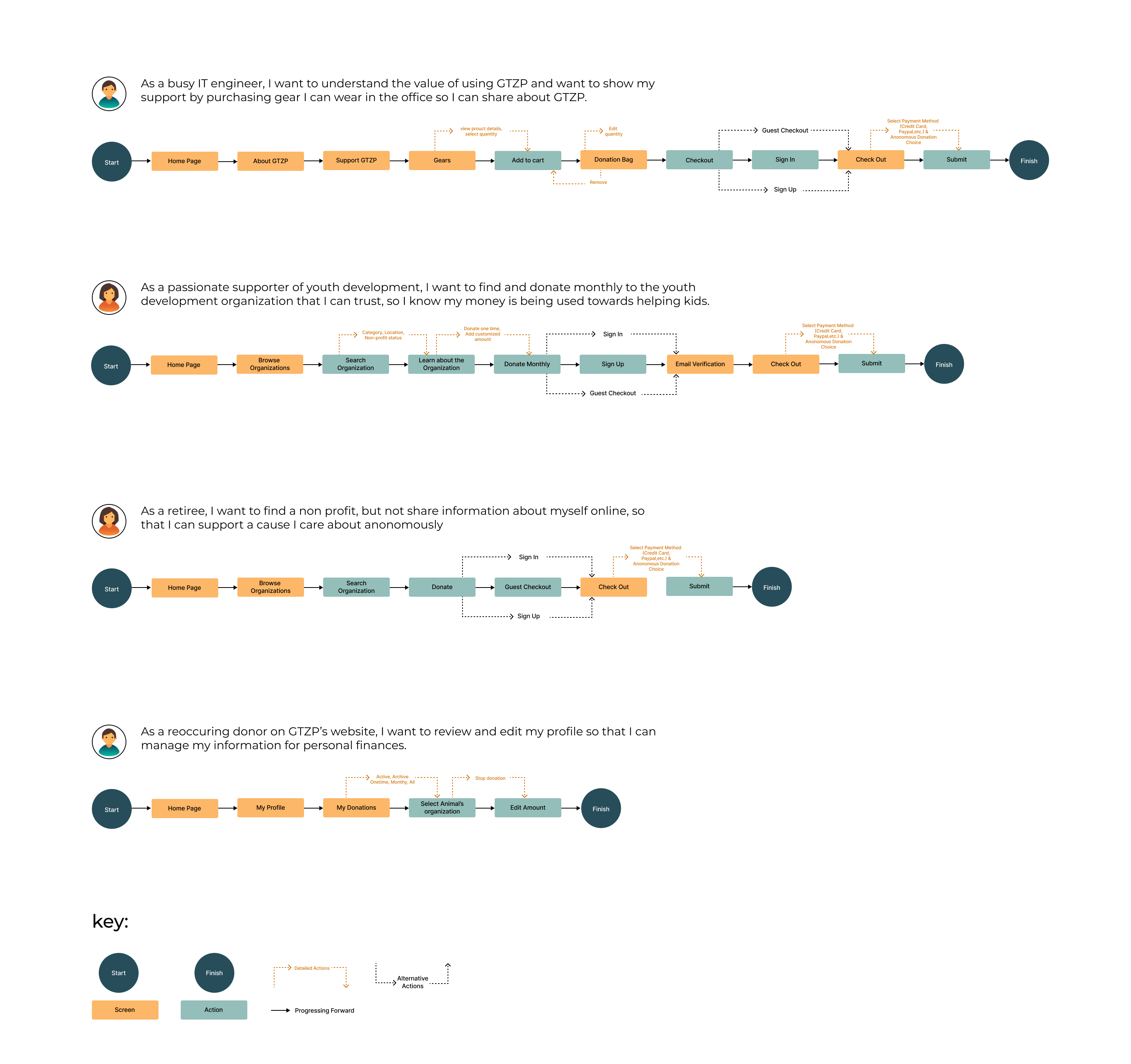
To capture the range of the donor audience, we developed personas based on this research and other research. Throughout the design phase, these were expanded into user stories describing important tasks. This enabled us to narrow our awareness of possible users and better match our design decisions with the user.
User stories
Information Architecture
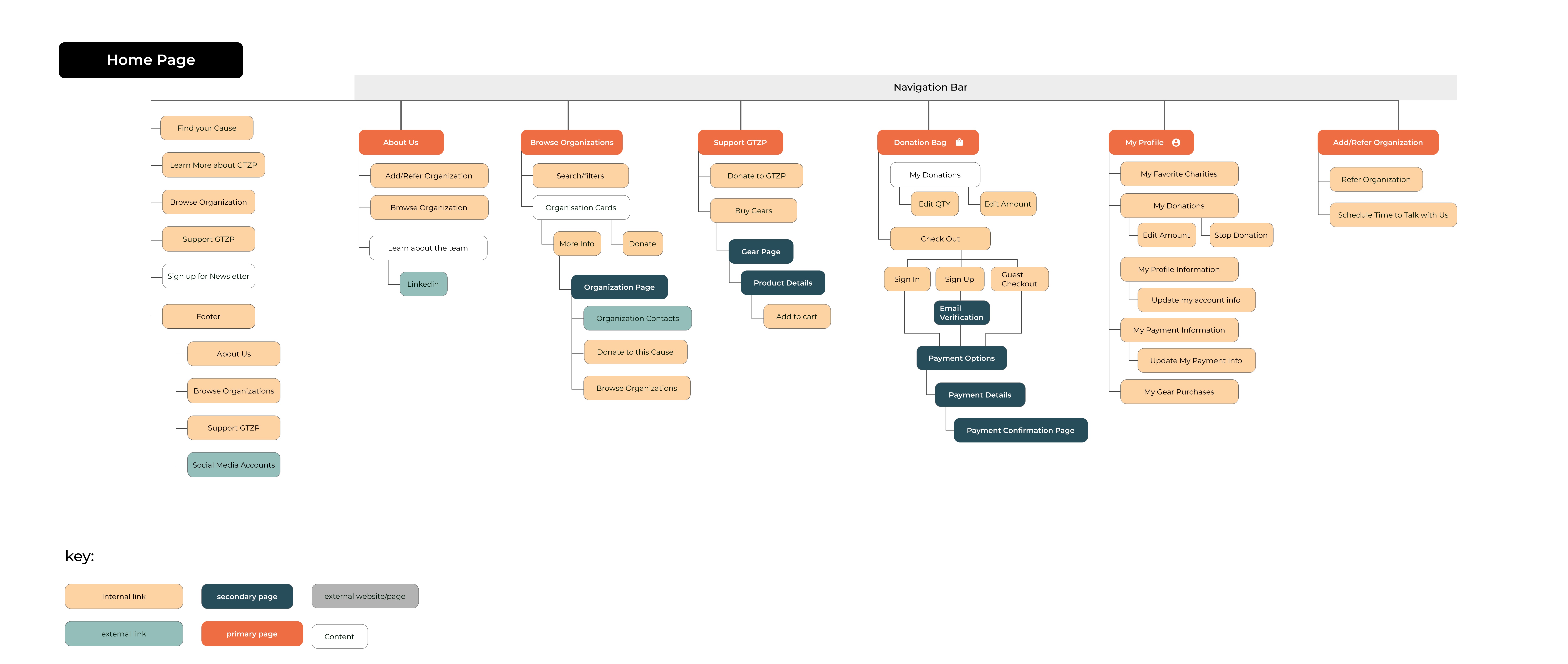
User flow
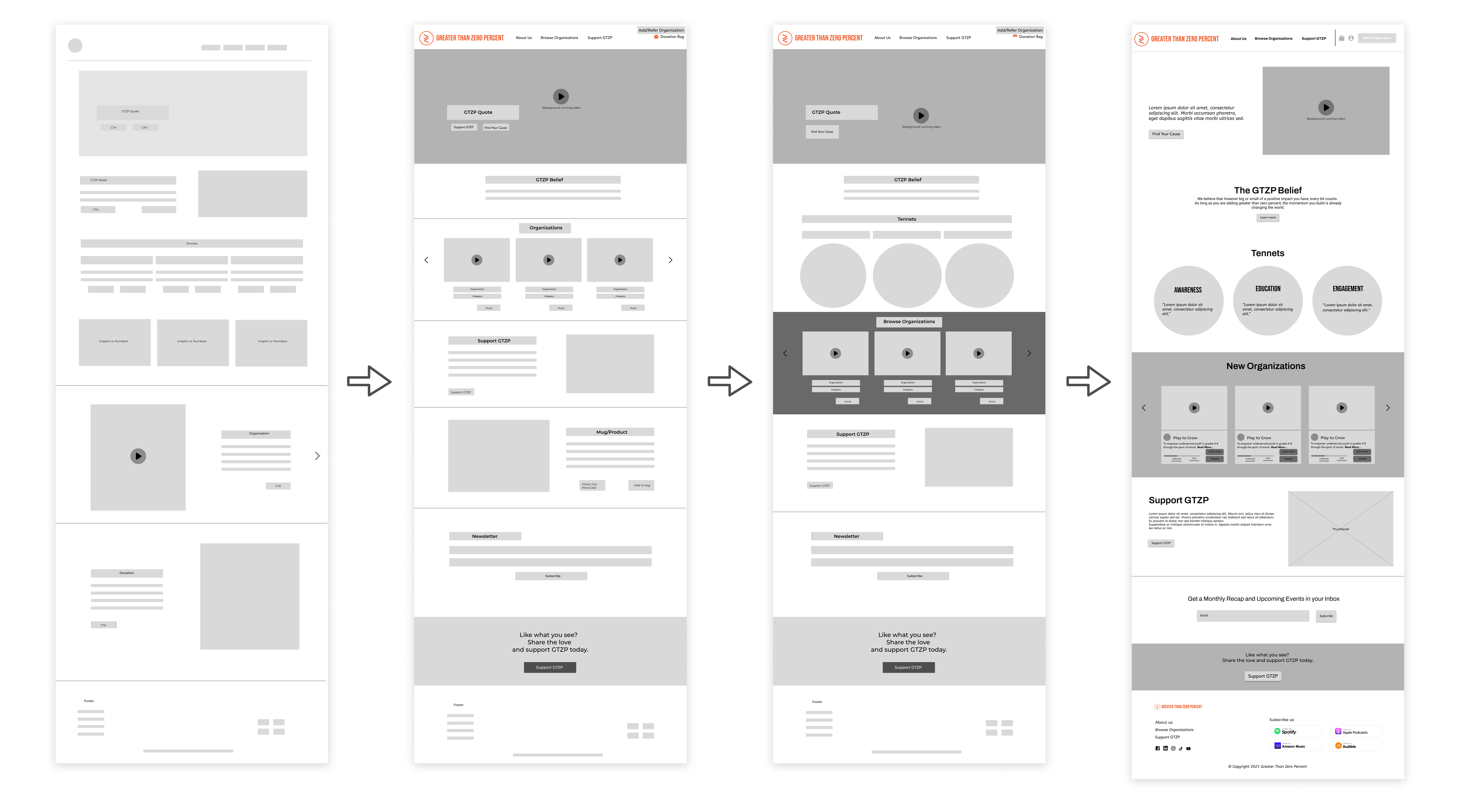
Design
Develop
Wireframe
We created six wireframes sets as a group and chose our best aspects to include in the first collaborative wireframe set. Through discussion and input from stakeholders, we developed a number of variations and improvements.
Testing
- The user found it challenging and confusing to finish the checkout procedure.
- The organisation search option on the homepage is not easy to locate for the user.
- The receipt confirmation was missing.
- Users were seeking for the connection, clarity and purpose of the donation.
- The user was redirected to the homepage after making a purchase/donation instead of being show other organisations.
- Added a visual/symbolic representation of the benefits of donating to the organization to show impact and improve credibility.
- Added receipt confirmation to confirm purchase.
- The user flow has been changed to redirect users to browse organizations, rather than the homepage, after purchase.
- Redesigned the checkout page to be two pages (with a progress bar at the top), which look identical.
- Relocated the purchase gear section off the primary navigation.
- Moved the Gear section off the primary navigation and added a Donate / Buy Gear bag, as well as a Profile.
Deliver
High Fidelity Prototype
The wireframes were then prototyped in Figma and validated with users to ensure that the navigated was clear and usable without any guidance from testers. Using feedback from both research participants and stakeholders, we iterated our designs from low to high fidelity.
Listen
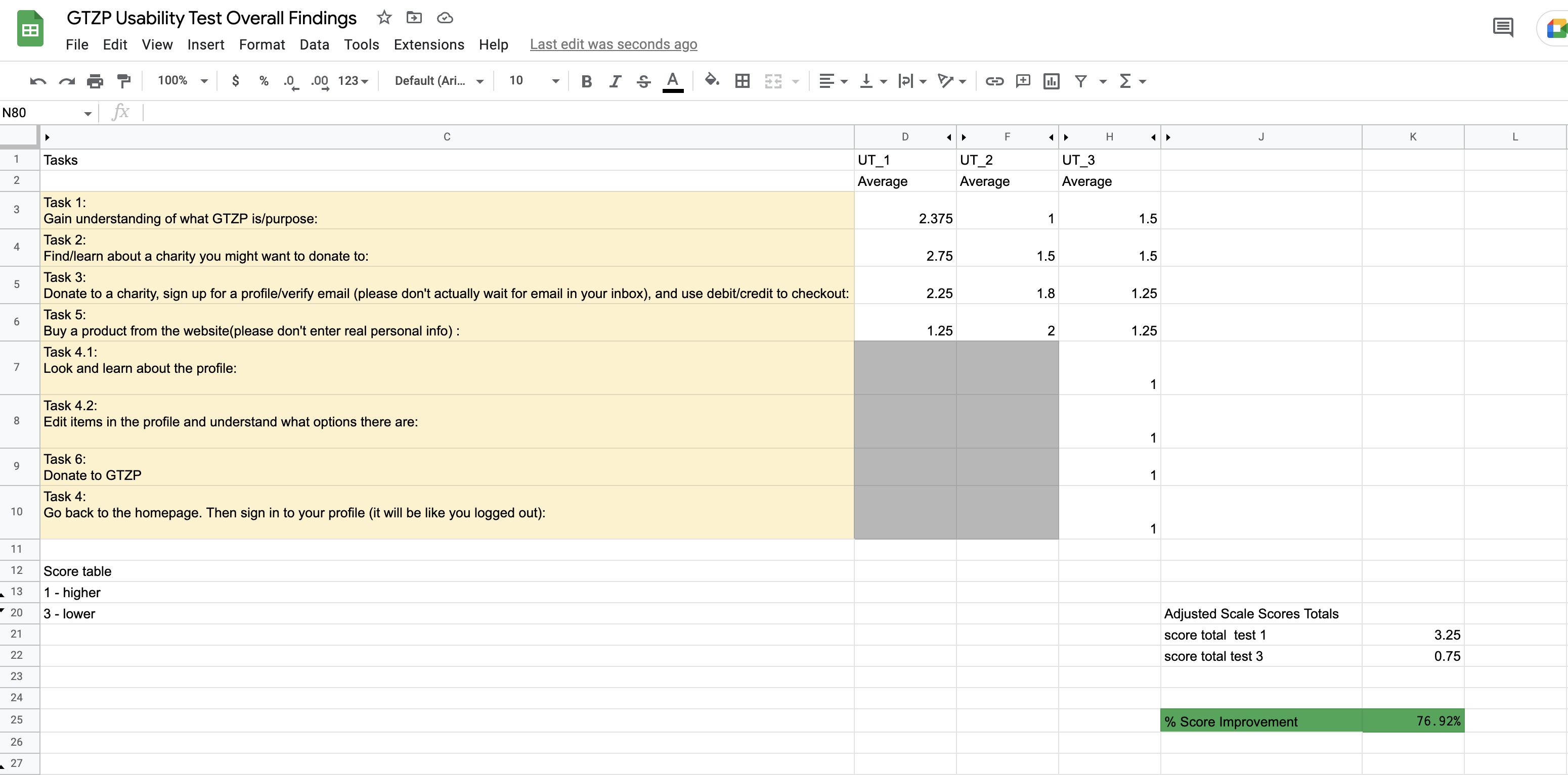
- Donation process was Quick and easy.
- 76.9% increase in average usability test score.
- The usability test helped us analyze that users are better able to achieve their goals, which means providing what they want on the relevant pages with fewer clicks.
Credits :
Project sponsor : Benefit.design
Team members : Nicole trahan, Shruti Bhagwat, Maha Bilal & Sijo Vadakeettil.
To see the updated website click here
