BRANDING
Avencore consultant
www.avencoree.com
Logo created: 2019
It’s an HR consultancy hiring professionals.
Logo representations: The upward shooting blue arrow is the alphabet A from the word Avencore manifesting growth and progress.(as it’s a HR consultancy hiring professionals as per their qualifications). The hind part is the reverse C of the word consultancy which is driven to success like a magnetic pull by the A of the Avencore.
Color representation: Blue represents trust and loyalty by the organization towards all its clients. Grey though mostly was taken as a dull and boring color actually creates a very soothing and cooling ambience. It’s a color which showcases standard as well. Above all grey when paired with blue elements creates ripples of relaxing atmosphere.
Bodylab fitness
Logo created: 2018
It’s a fitness center.
Logo representations: The core part of the logo shapes itself from the figure of a fierce and strongly approaches Bull and Bull being a universal representation of masculinity and strength apts the logo. The star symbolizes a distant divine force or energy, it has positive energy. In contemporary art, design and the modern world, the star is widely used as a symbol of something beautiful, good and positive.
Color representation: The logo is blended together with the two most extreme ends of the color spectrum, the black and the white. White represents purity and a new beginning.(beginning for a new healthy and t lifestyle). Black on the other hand is associated with sophistication, luxury, condense and strength (the one which this new lifestyle change would bring in, a new outlook to life.)
perfect constructions
Logo created: 2016
This company is into construction business
Logo representations: The logo represents a reverse P and lateral view C depicting the shape of a Building which represents construction company as a whole.
Color representation: The color blue is often associated with depth and stability which is the ultimate strength of a construction company. It also symbolizes trust, loyalty and faith.
NS Infra construction
This company deals with infra for residential
Logo representations: NS Infra construction company is projected with this eye-catching logo which has its N and S from the name NS and its beautifully crafted as the house entrance with a fancy glimpse of the rooftop and a door.
Color representation: Maroon was chosen as the color for the logo as it represents creative thoughts, art and beauty.
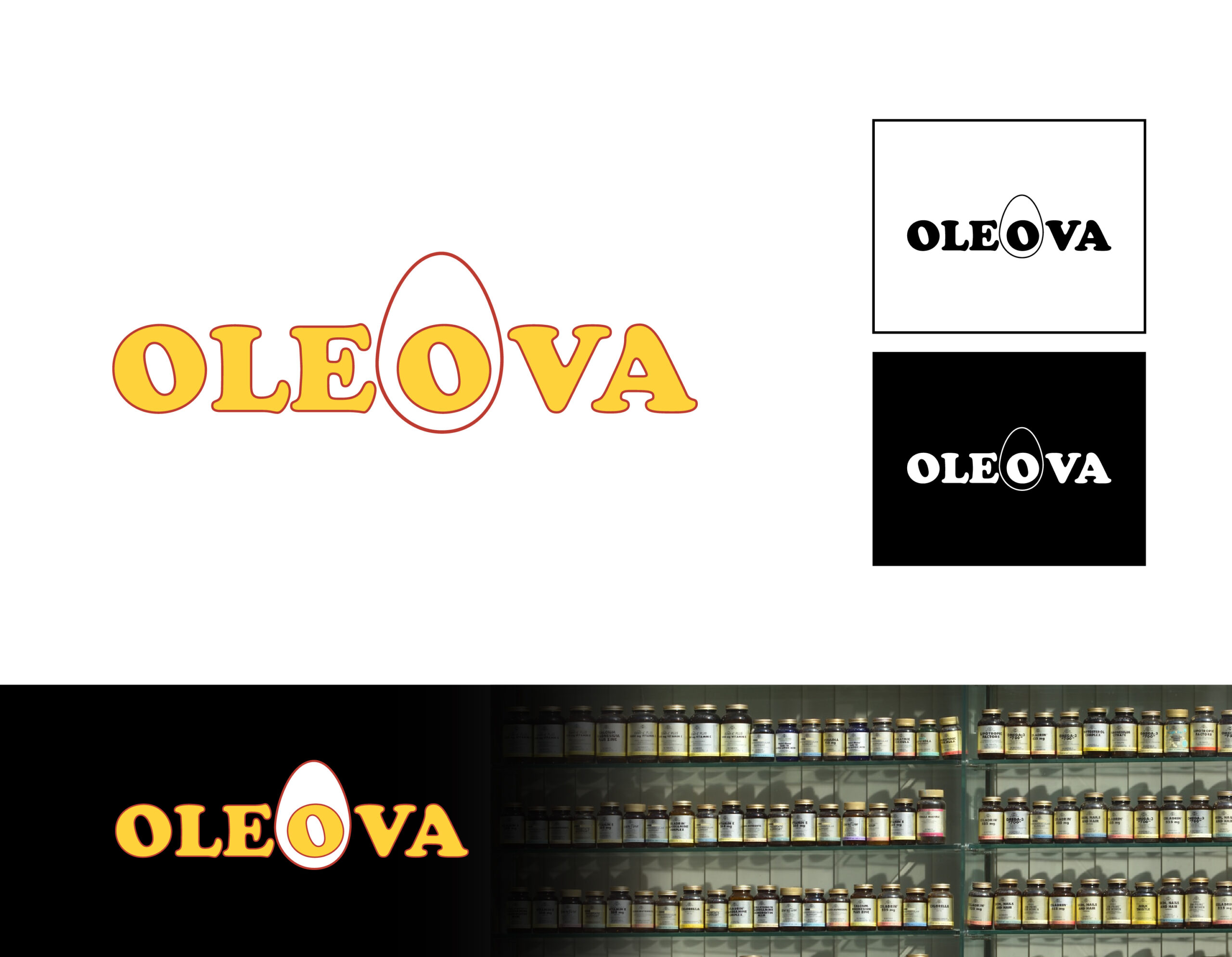
oleova
Oleova is a brand of VAV Life Science Pvt Ltd.,
Logo representations: It’s a company deriving oil from the egg yolk. Hence the symbolic representation of the alphabet O with the yolk in the center and that comes in as the highlight of the text.
Color representation: Yellow represents the feel of oil and blend of
Yolk. White depicts the egg shell giving a catchy gaze to the representation.
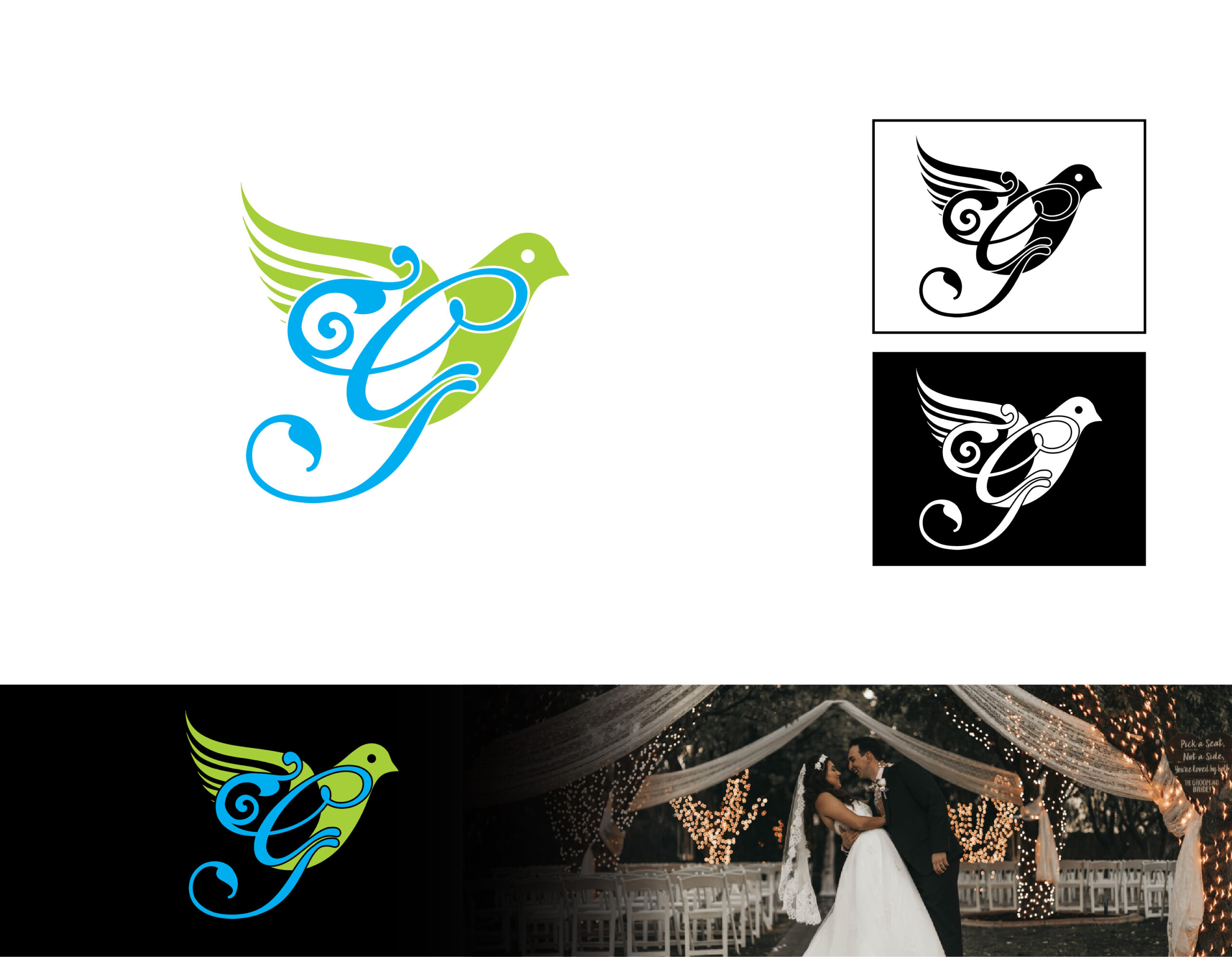
grace events
It’s an event company that shoulders out great occasions.
Logo representations: The alphabet representation of G has been derived from the word Grace. Dove is a symbolic representation of the Holy Spirit from the Holy Trinity, the last but not the least among the Trio who encompasses the divinity and holds the purity together. Likewise, together with the client the event company would shoulder them at each and every requirement to make it a success.
Color representation: Green represents Life. In the same way Grace Events makes all events lively and enthusiastic. Blue represents divinity and presence of the Almighty and hence signees good Omen to the occasion.