case study
ORANGE CLINIC
Website and mobile application for a dietitian.
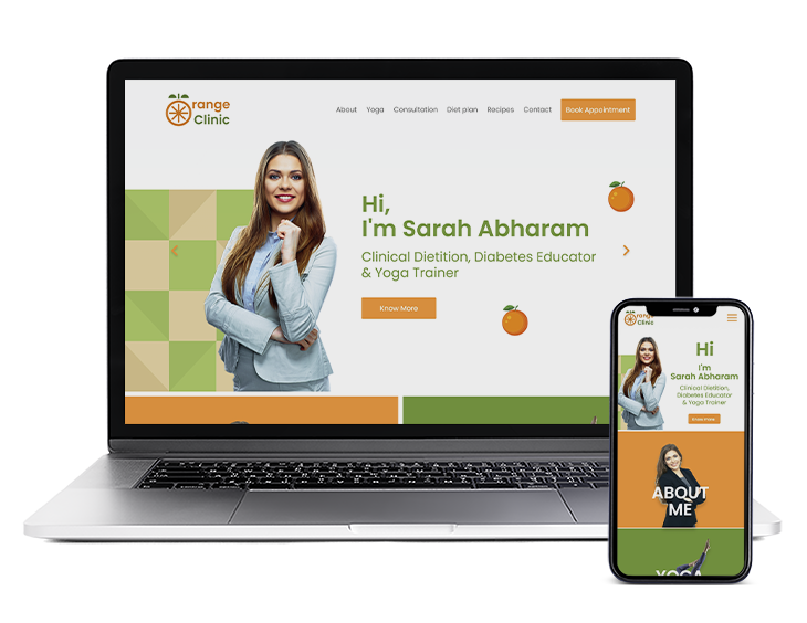
This case study is a part of my Master’s programme (2020-2021). The Aim of this case study was to create an web and mobile application which will help the owner to promote the business online. Also to provide useful information regarding diet. Through this application the user can avail services.
Problem Statement
Goal
Process
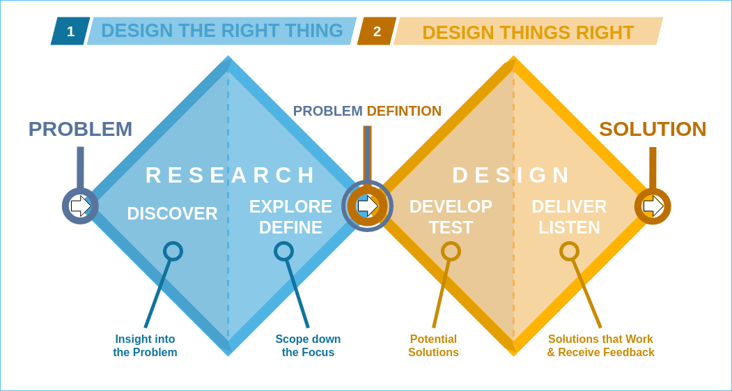
Discover
Competitive Analysis
What 2 Eat
www.what2eat.ie
Summary
Sonja is a highly experienced dietitian, with a passion for her work. Having worked for over 13 years as a community dietitian.
Pros
• Good layout with required information.
• Images are related to Diet.
• Easy booking.
• Vibrant color has been used for website.
• Easy to navigate for information.
Cons
• Navigation menu is not static.
• Time mentioned on booking is incorrect.
• Color for paragraph font is too light for white background.
Spectrum nutrition
www.spectrumnutrition.ie
Summary
Spectrum Nutrition is part of the spectrum health group, one of Ireland’s leading providers of allied health services.
Pros
• Well designed layout with complementary color scheme.
• Bigger font has be used.
• Detail description about the programme has been mentioned.
Cons
• Booking is bit confusing.
• Fees not mentioned on fees page.
• Lots of information to navigate.
Didititian
www.didititian.com
Summary
Didi is an registered dietitian and founder of didititian. Also a senior dietitian for HSE.
Pros
• Easy Navigation.
• Information related to diet on single page.
• Articles, Video amd recipes related to healthy living.
Cons
• Form is not align properly.
• Article content need to rearrange
• Icons need to be fixed in contact page.
• Background distracts while reading.
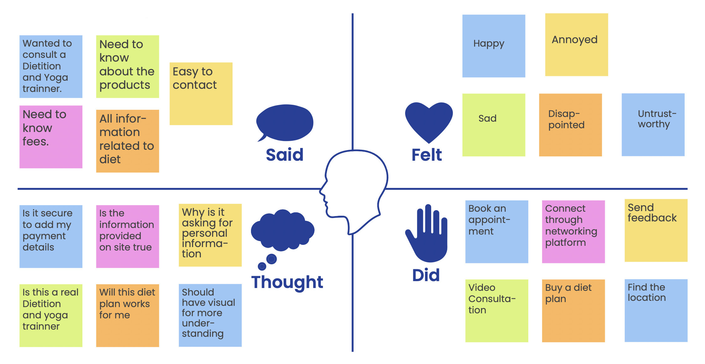
Empathy Map
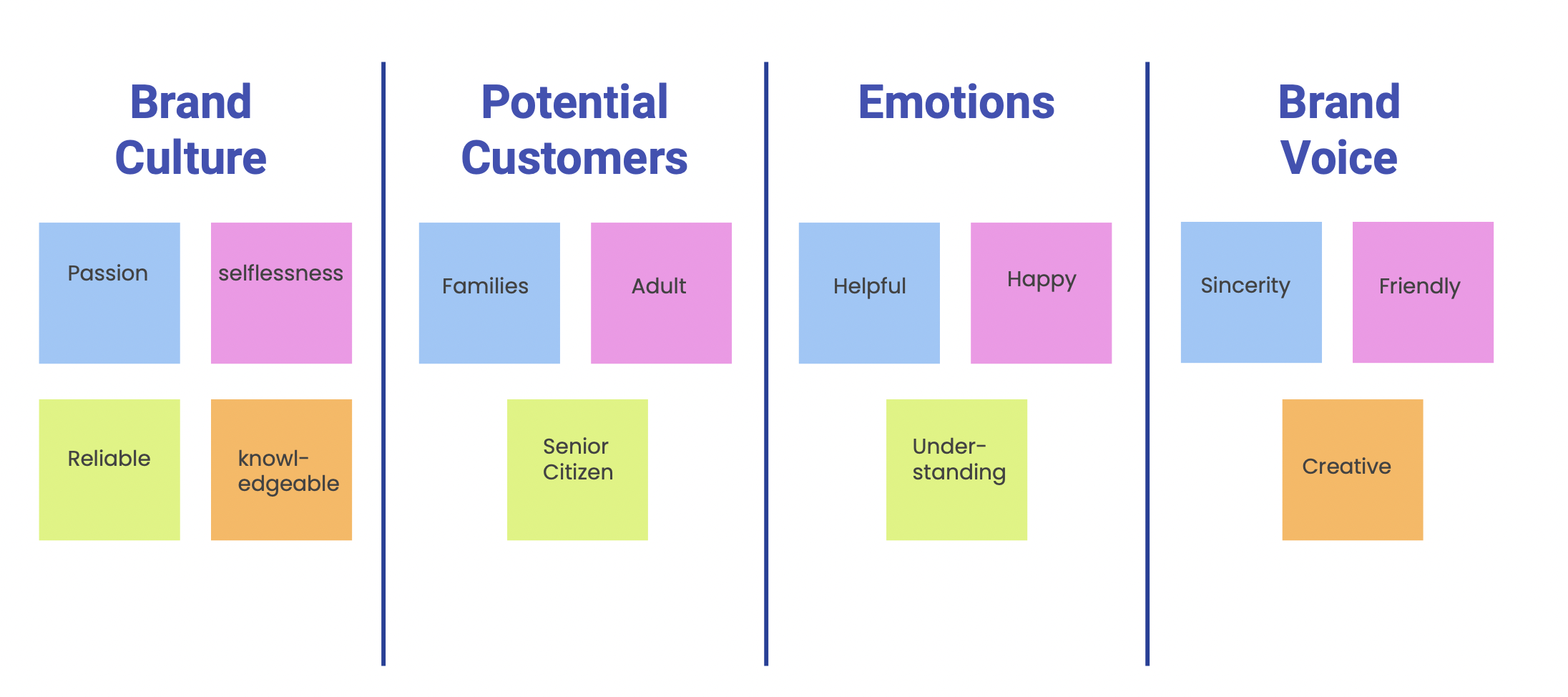
Brand Attributes
Define
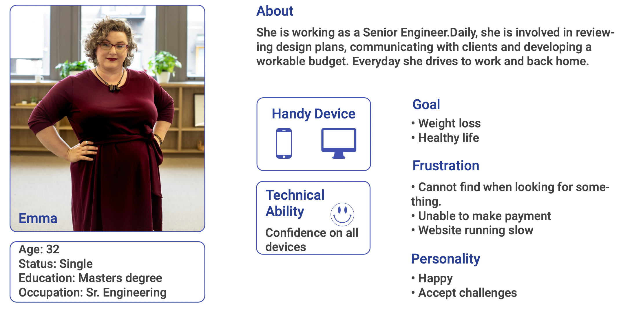
Persona
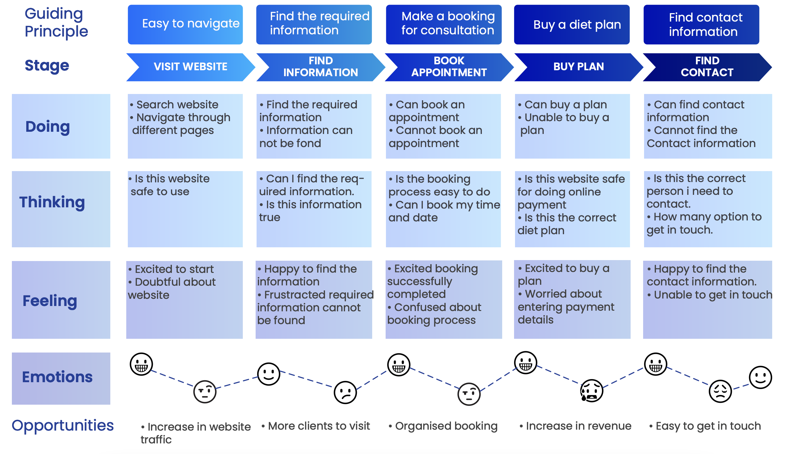
Customer Journey map
Card Sorting
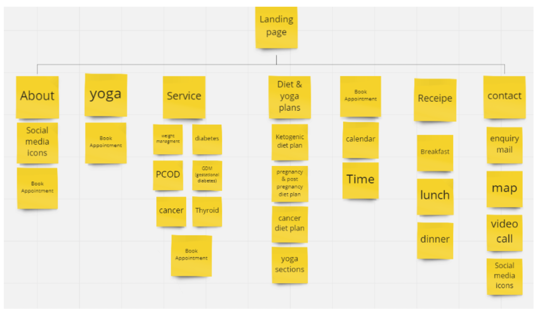
Card sorting is a user testing technique that helps me to decide how to structure the website.
I used this technique to figure out how much users already know about the product or service. Card sorting also reveals their mental models and based on these outlines the best way to organize information architecture.
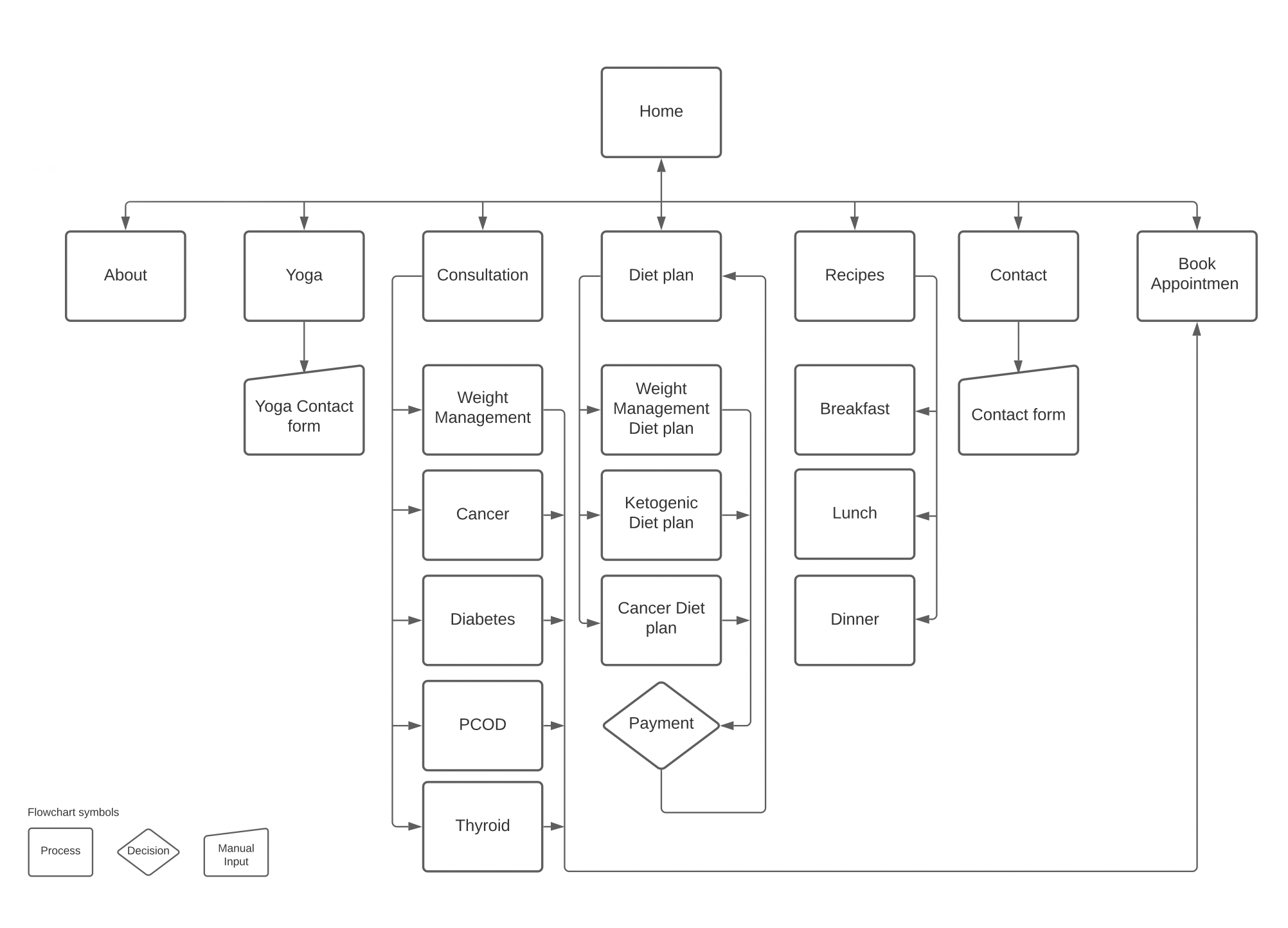
Task flow Diagram
Visual Research
Visual research is a qualitative research approach that generates and represents knowledge using creative forms. Film, Photography, drawing, painting and sculpture are among the artistic mediums.
A mood board was created for different page and layouts. Reference for icons and buttons was used.
Type Testing
After experimenting with some different typefaces, I narrowed it down to two options. After more research, I decided that Poppins was the right font for this project.
Poppins seemed to be the perfect option for conveying message to the customer and help the reader want to read what is written when the subject matter is uninteresting.
The reason I selected Poppins font is because it is Web safe fonts and they ensure your site looks good across all devices. Poppins is geometric in style, clean and includes 18 different font weight from thin to black.
Color Research
Color increases brand recognition highlights important website elements and influences how people feel about a website. Different colors produce different emotions in people, so it’s important to choose the right colors. White space, contrast and good color schemes are vital elements of good website.
As I was building a website related to health, I had a plan to use the color which will represent the health or recreation, healing.
Develop
Paper Prototype
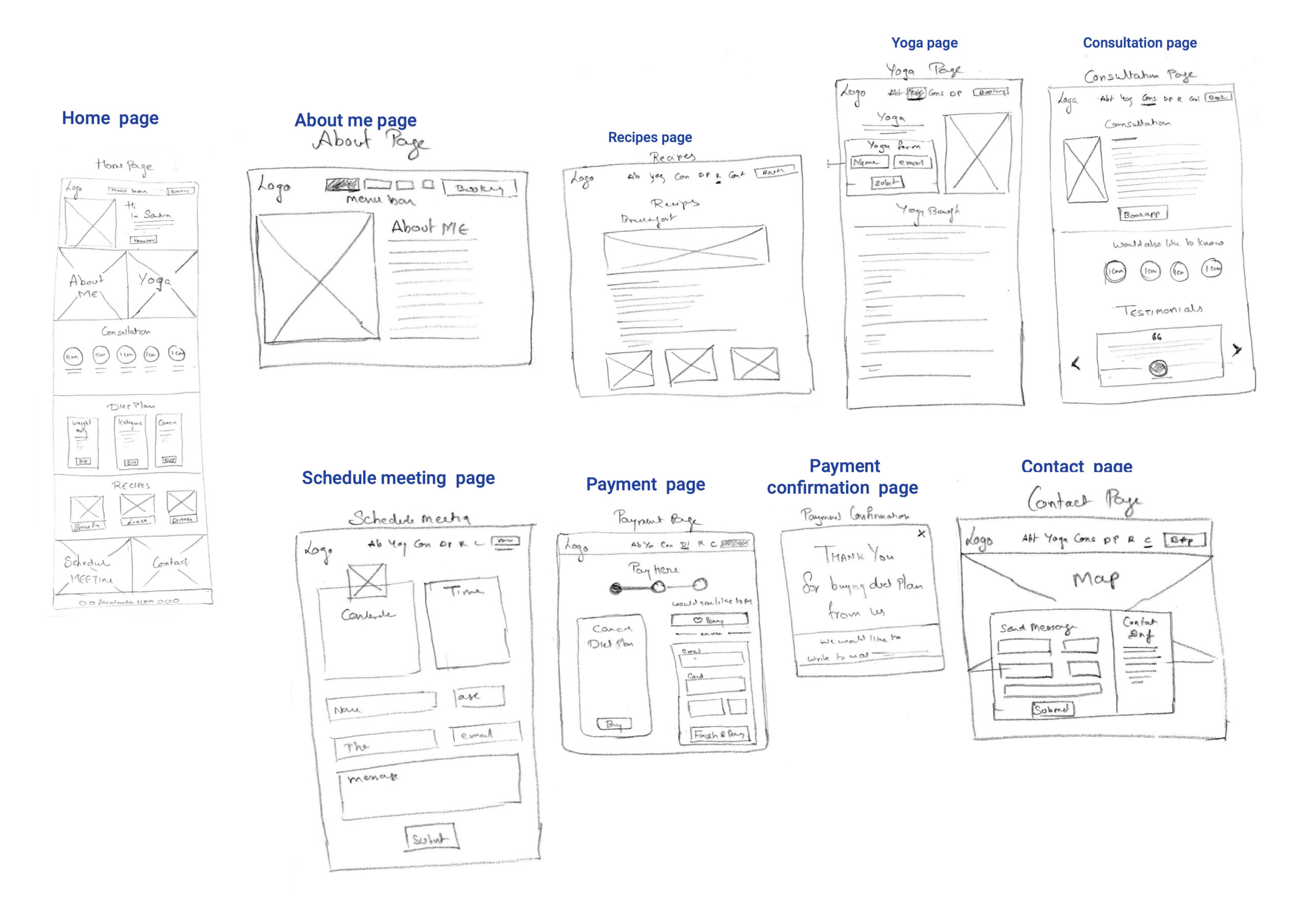
Paper prototypes are primarily used to understand the purpose. The main objective is to develop a working product that offers immediate and quick value at minimal cost. Task flows have helped develop this prototype. As part of this process, certain landing pages were deemed unnecessary, and as a result, they were removed. Additionally, a few new pages were added that were considered important.
Minimum Viable Product (MVP)
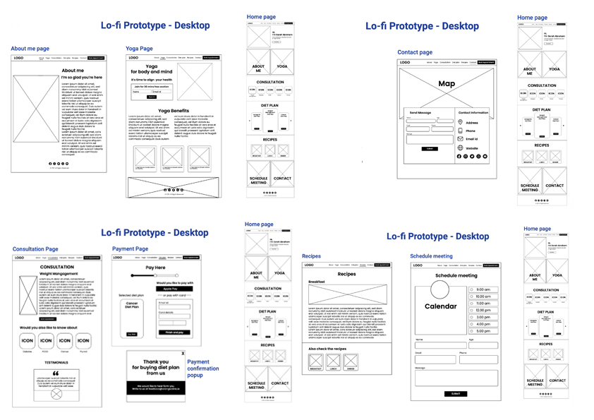
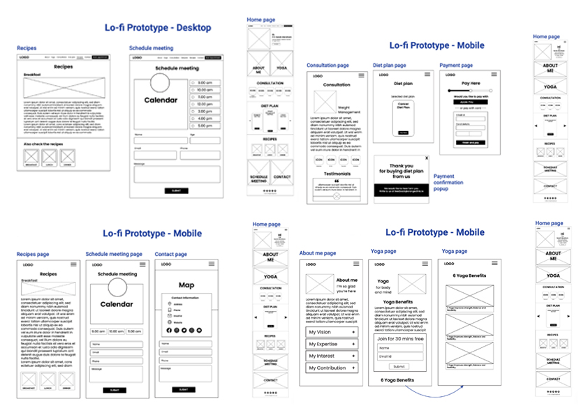
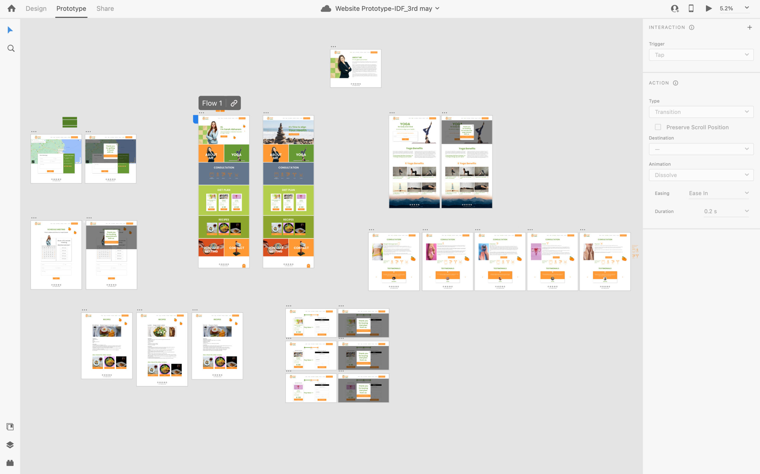
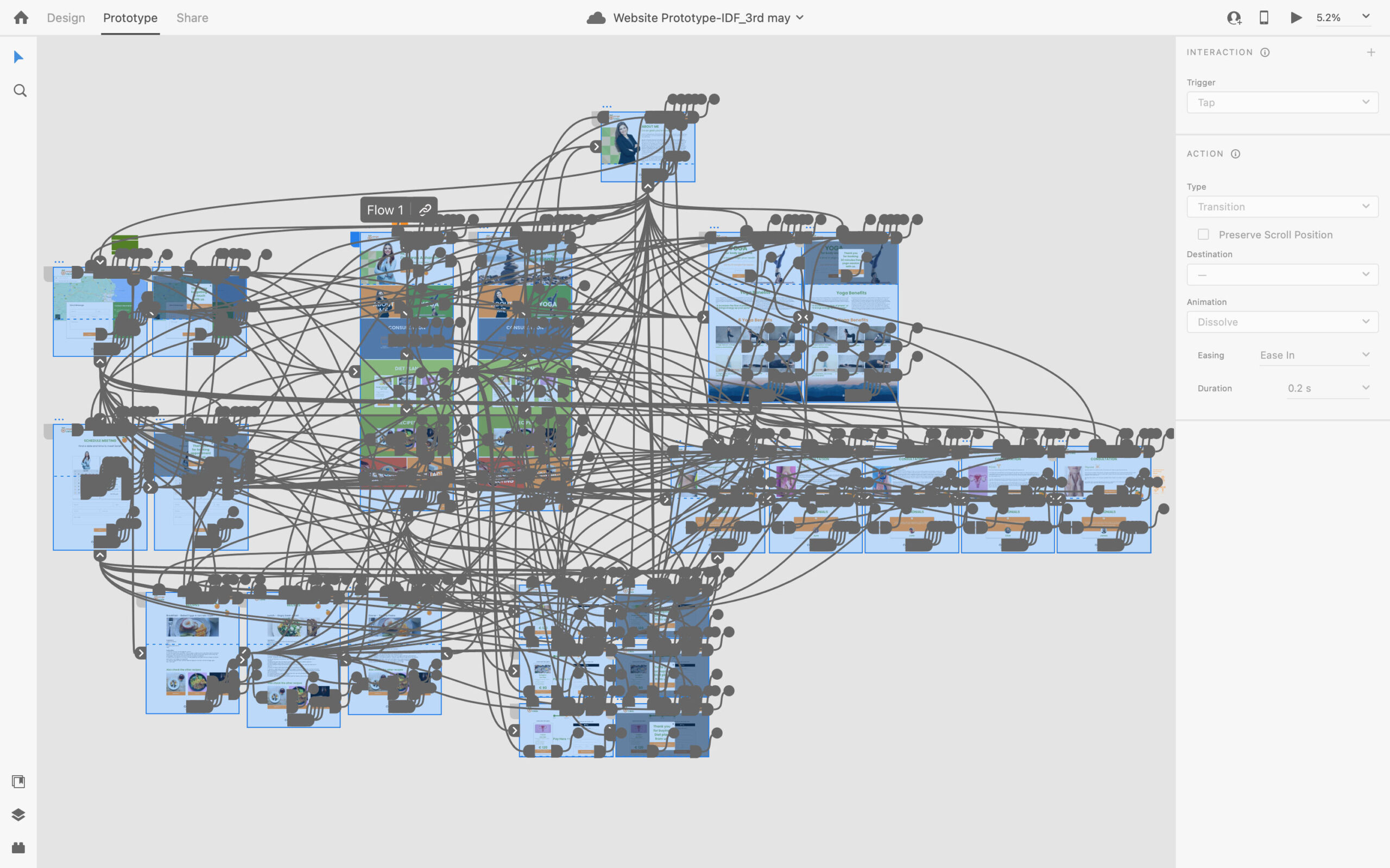
I used adobe XD to layout low fidelity prototype. As it was started building desktop version for website the research was very helpful. It helped me to take the decision very easy for the placement of content. Information architecture also played a major role to the development of the website.
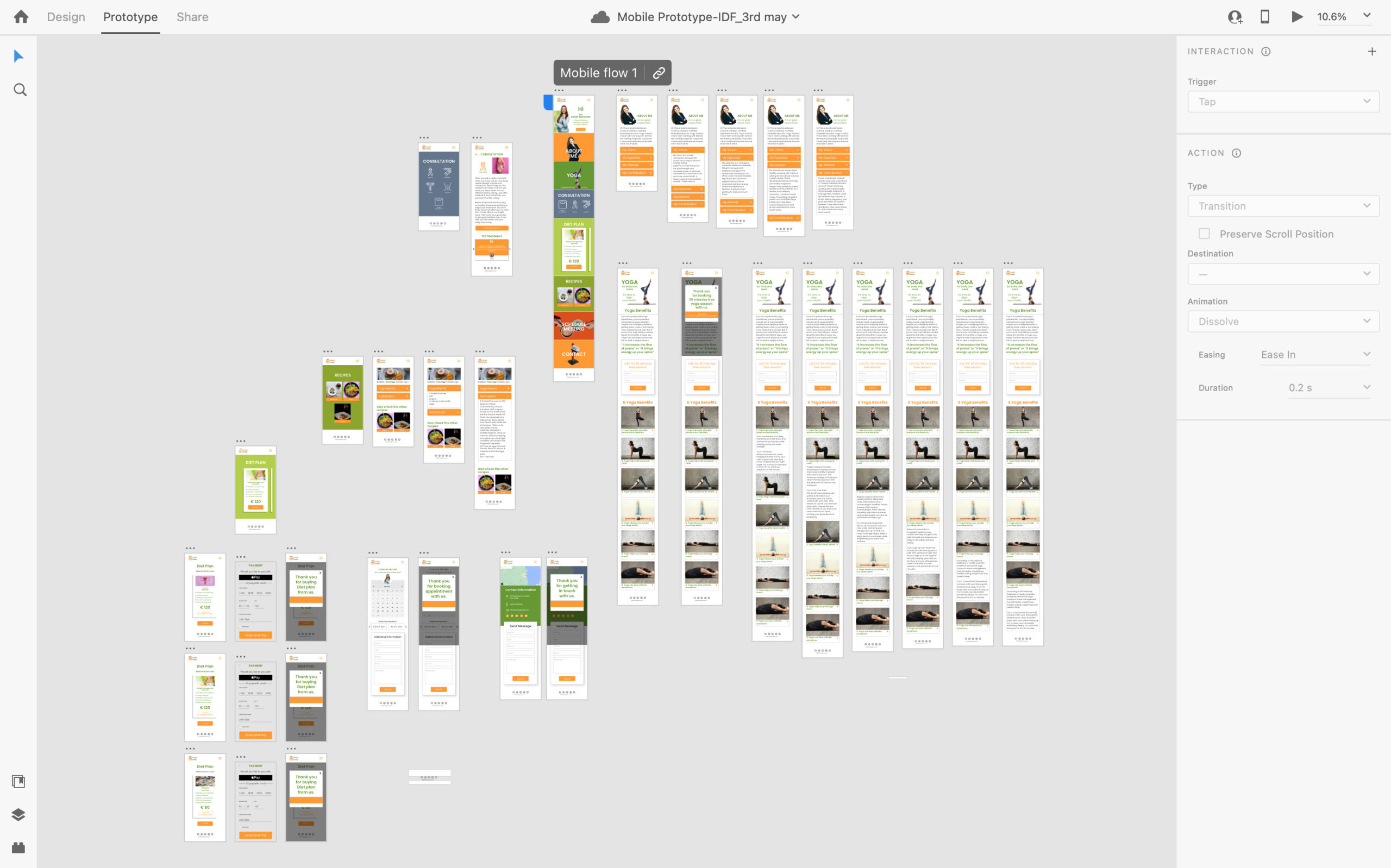
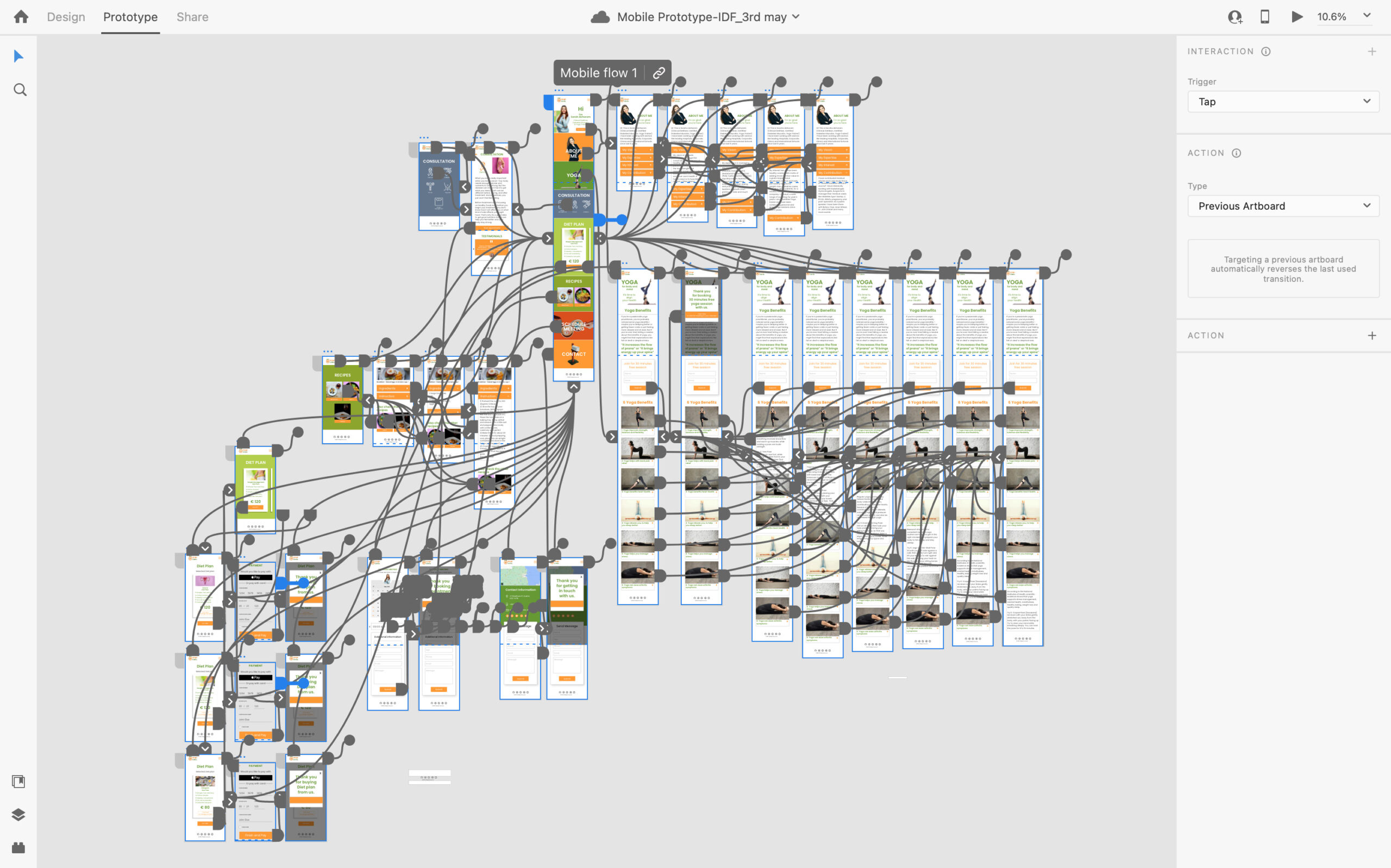
After completing the desktop version of website, my task was to make the desktop version to mobile version. This was a bit challenging as the whole long form data has to be fit to mobile screen with limitations.
I discovered the process a little extreme at first. It was hard to take a idea from the desktop version to mobile version. Also, see how they could fit in a small place.
Some of the layout was replaced with the one which can adopt to mobile screen. Reading long content was a great barrier. This has been fixed with the smaller font size. Some of the Image placeholder were reduced in size. Some of the image placeholder were reduced in size. Long form of menu was replaced with burger style.
I made an honest effort to make the mobile version look alike with the desktop version.
Testing prototype
For my user testing I set the user 5 tasks.
- Check for available consultation
- Book a free session for yoga
- Buy a diet plan
- Send a message to contact the Dietitian.
- Book appointment with the dietitian.
- Users were looking for more consultation.
- Less users scroll down to read the testimonial.
- Users were looking of specific diet plan.
Deliver
High Fidelity Prototype
My Learnings
Overall, I’m happy with the outcome of the assignment. Having both mobile and website designs is a requirement of any work spec. I have looked at, so I decided to make it interactive rather than static. This project was challenging at various stages. I have learned a lot when developing a new website, considers the customer, offers the appropriate steps and it should be enjoyable to use. The most valuable lesson I learned from this project was to test the concept on the screen for which it was developed. When I tested it on the screen. it was a significant difference. Another thing I learned was how to move content from the large screen to the small screen. (From desktop to smartphone screen).
Throughout this project, I had to force myself and give my best. I have also learned a lot about content management and the value of being through while attempting to develop a concept that works.
More could be learned, but i think this experience has taught me a lot. My ability to document my design process, I believe has also increased, which will help me when delivering research to clients.
